
The Psychology of Color in Design: How Hues Influence Emotions
When you see a red stop sign, you immediately know to halt in your tracks. Similarly, when you walk into a cozy coffee shop painted with warm earth tones, you feel more relaxed and at ease. These experiences highlight the powerful influence that color has on our emotions and behaviors. In the world of design, understanding the psychology of color is paramount in creating impactful visual experiences that resonate with people on a deep level.
Colors have the ability to evoke specific emotions and trigger certain responses in individuals. This phenomenon is rooted in the psychology of color, a field that delves into the psychological and physiological effects of colors on the human mind. Whether you’re designing a logo, a website, or an entire brand identity, it’s crucial to choose the right colors to evoke the desired emotional response.
Let’s explore some common colors and the emotions they typically evoke:
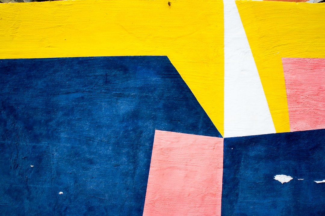
1. Red: This vibrant color is associated with passion, energy, and excitement. It grabs attention and can evoke feelings of urgency or importance. Many fast-food chains and clearance sales use red in their branding to stimulate appetite or encourage impulse buying.
2. Blue: A color often associated with trust, calmness, and security, blue creates a sense of stability. It is frequently used in corporate logos to establish a sense of reliability and professionalism.
3. Yellow: This sunny color is often associated with happiness, optimism, and creativity. It can stimulate mental activity and is commonly used to grab attention and highlight information.
4. Green: A color associated with nature, growth, and harmony, green has a calming effect on people. It represents freshness and is often associated with environmentally friendly brands.
5. Purple: Often associated with luxury, creativity, and spirituality, purple has a soothing and calming effect. It is frequently used in beauty and wellness industries to create a sense of elegance and opulence.
Understanding the way colors influence emotions is crucial to telling a brand’s story. Colors can help create a mood or convey a particular message. For example, a healthcare brand may use calming blues and greens to instill a sense of trust and serenity, while a flashy entertainment brand may opt for bold and energetic colors to evoke excitement and adrenaline.
It’s also important to recognize that cultural and individual differences can influence how colors are perceived. While red may evoke feelings of luck and wealth in Chinese culture, it can also symbolize danger or anger in others. Therefore, it’s crucial to consider the target audience and their cultural background when selecting colors for design purposes.
In addition to evoking emotions, colors can also be used to guide user behavior. For example, “Call to Action” buttons on websites are often designed in contrasting colors to grab attention and encourage interaction. Colors can also be used to organize and categorize information, making it easier for users to navigate and understand complex content.
In conclusion, the psychology of color in design plays a crucial role in influencing emotions, behaviors, and perceptions. The right color choices can create a powerful visual experience that resonates with individuals and strengthens brand identities. By understanding the emotions associated with different colors, designers can unleash the full potential of color psychology to create impactful and meaningful designs.