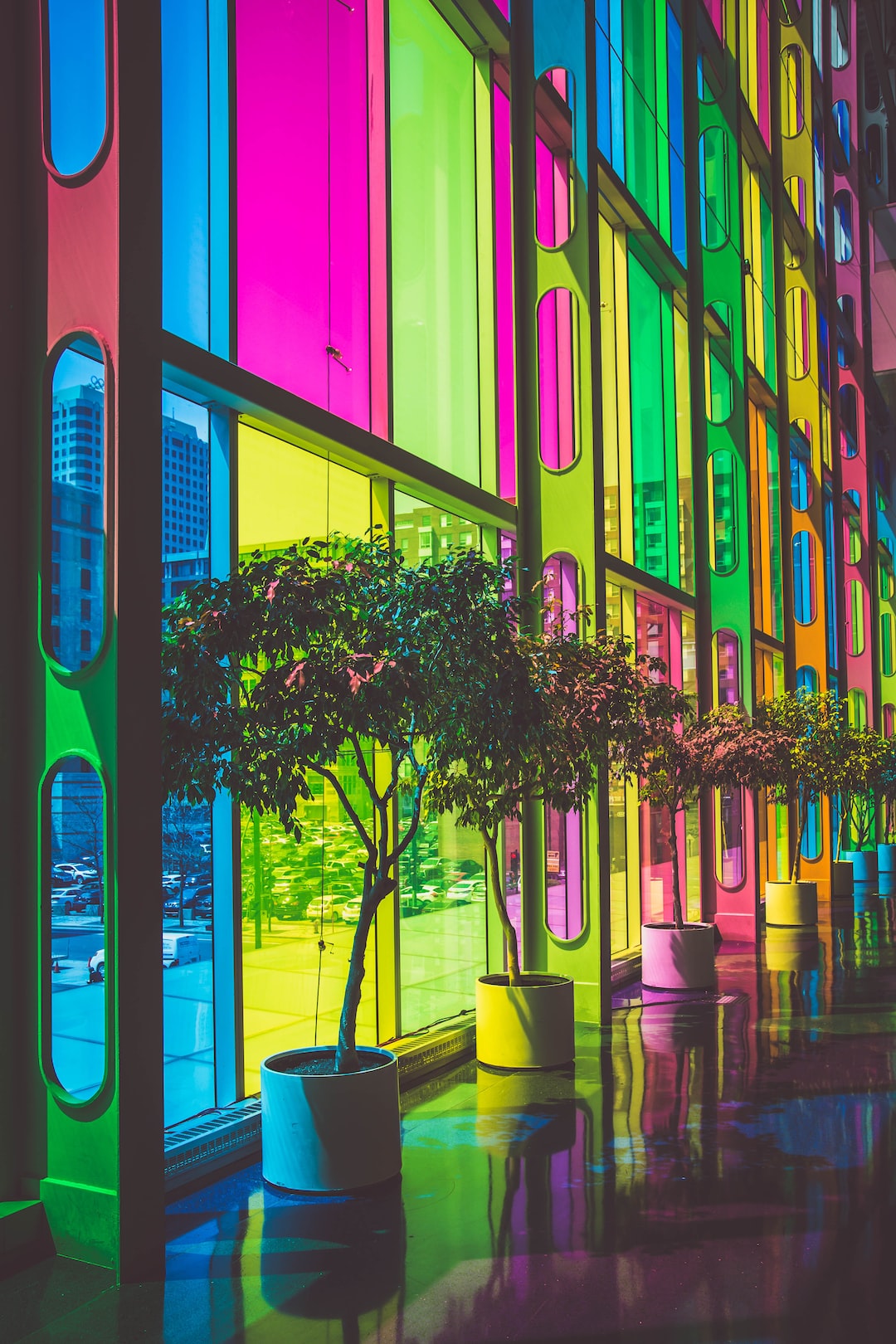
Photography and Design: How to Create Stunning Visual Harmony
Visual harmony is a key aspect of photography and design that plays a significant role in creating stunning and captivating images. Whether you are a professional photographer or a design enthusiast, understanding how to achieve visual harmony can elevate your work to a whole new level. In this blog post, we will explore various techniques and strategies that will help you create visually harmonious compositions.
1. The Rule of Thirds: One of the fundamental principles in both photography and design is the rule of thirds. This rule suggests dividing your frame into a 3×3 grid by placing two equally spaced horizontal and vertical lines. By aligning your main subject along these lines or at their intersections, you can create a visually harmonious and balanced composition.
2. Balance and Symmetry: Another technique to achieve visual harmony is through balance and symmetry. Symmetry creates a sense of equilibrium and order, while balance evenly distributes elements throughout the frame. Experiment with symmetrical compositions, such as reflections or mirroring, to create visually pleasing images that are harmonious and soothing to the eye.
3. Color Harmony: Selecting a harmonious color palette can greatly enhance the visual harmony in your photographs or designs. Consider complementary colors (those opposite each other on the color wheel) to create a high contrast effect that adds visual interest. Analogous colors (neighboring each other on the color wheel) create a more unified and cohesive look. Utilize color schemes that evoke the desired mood and emotion, as different colors can convey different meanings.
4. Consistency in Elements: Maintaining a consistent theme, style, or element throughout your photographs or designs helps to establish a sense of visual harmony. It could be a recurring color, texture, shape, pattern, or even a specific subject matter. Consistency in elements creates continuity and cohesion, allowing viewers to connect different images and form a harmonious narrative.
5. Use of Lines and Shapes: Incorporating lines and shapes within your composition can lead the viewer’s eye through the image, creating a sense of flow and harmony. Diagonal lines add dynamism, horizontal lines create a sense of calmness, and vertical lines can evoke a feeling of strength and stability. Likewise, shapes, such as circles, squares, and triangles, can contribute to the overall visual harmony by adding structure and balance to the composition.
6. Negative Space: Negative space refers to the empty or open areas within a composition. Adequate usage of negative space allows the main subject to stand out and helps to maintain a balanced and harmonious composition. Don’t be afraid to leave some areas empty, as it can create a sense of simplicity and elegance, drawing the viewer’s attention to the key elements of your image.
7. Texture and Depth: Incorporating texture and creating depth in your photographs or designs can greatly contribute to visual harmony. Texture adds a tactile quality, making the image more visually engaging and interesting. It also helps to define different elements within the composition. Creating depth, on the other hand, provides a sense of distance and perspective, contributing to a more realistic and vibrant image.
8. Rule Breaking: While understanding and implementing these techniques can help achieve visual harmony, it is also important to know when to break the rules. Experimenting with unconventional compositions, unbalanced elements, or unexpected color combinations can often result in visually striking and unique photographs or designs. Rule breaking can add an element of surprise and intrigue, making your work stand out.
In conclusion, visual harmony is vital in photography and design as it creates a sense of balance, unity, and interest within your compositions. By understanding and implementing techniques such as the rule of thirds, balance and symmetry, color harmony, consistency in elements, lines and shapes, negative space, texture and depth, and knowing when to break the rules, you can create stunning and captivation visual narratives. Remember to experiment, practice, and allow your creativity to flow as you explore the world of visual harmony in your photography and design endeavors.
Sydney Bump to Baby photography: This year we decided to book Amanda to photograph us and WOW I am so, beyond happy that we crossed paths.
Gold Coast Photography: Specialising in family, maternity, and newborn photography on the Gold Coast. Let me preserve your cherished memories. Gold Coast Photographer.

